
A few Twitter accounts have started to get some special features, which others are missing. It looks like Twitter are rolling out partial web updates to various users as a trial.
Here’s an example of the new layout for the web homepage:
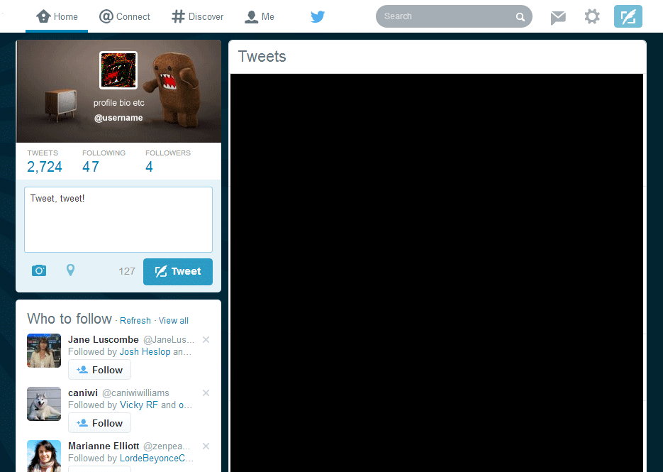 It’s running a white menubar on top, whereas the previous one was black. The bio, header, and username now display in a box on the top right, and the tweet button is more prominent. The icons on the right have been updated, too. Overall it’s a cleaner interface, and very nice to use.
Meanwhile, I’ve started getting popups in the bottom right corner for everything appearing in the Connect tab.
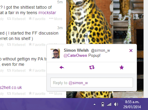
It gets a little annoying. Good notification system, but you need to be able to control what’s popping up – when you get it for every single RT and favourite, it’s a bit overwhelming. Customisation please, Twitter!
DMs also show via the popup and you can reply straight from that screen – good stuff!
The changes seem to be user focused, attempting to make Twitter web a cleaner interface, and bringing in some of the real-time functionality we see in clients such as Tweetdeck. They just need to get the balance right, which I’m sure will come from beta testing and user feedback.
Have you seen any changes to Twitter web lately?
I cannot believe you do not follow Jane Luscombe!
I do… This was an example account because at the time, my account didn’t have the new layout. Jane is awesome 🙂